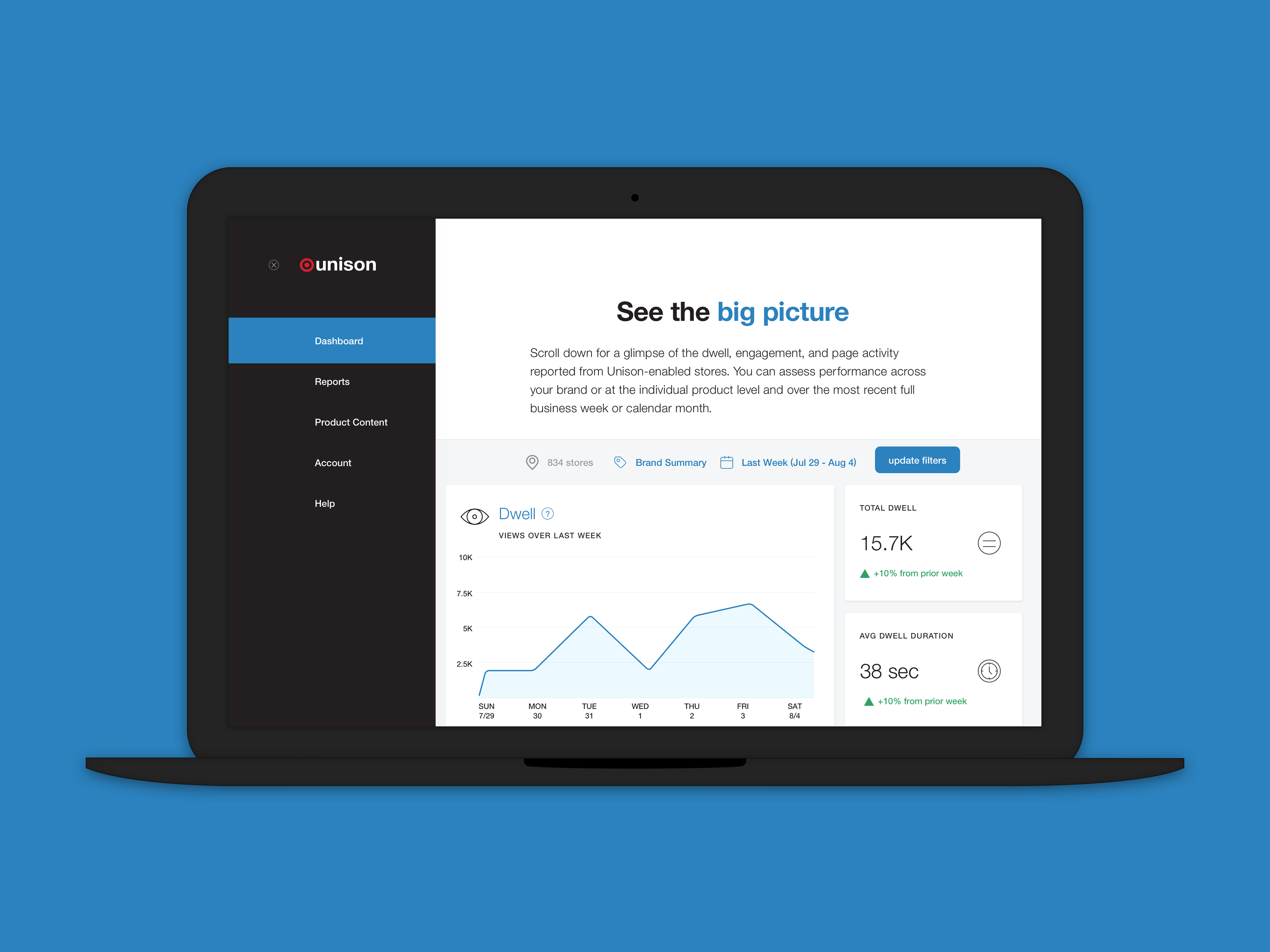
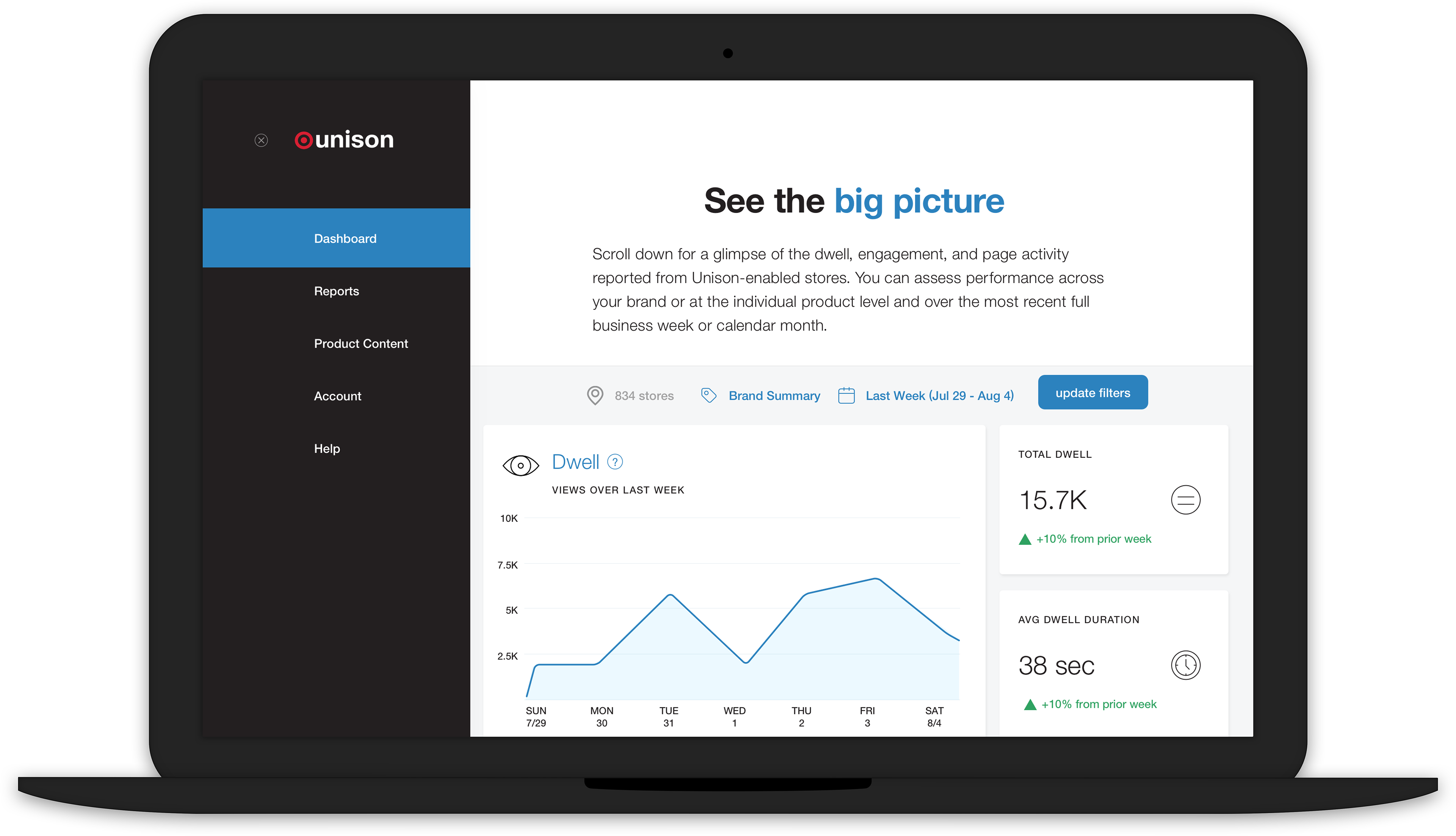
Landing page for the new Vendor Dashboard.
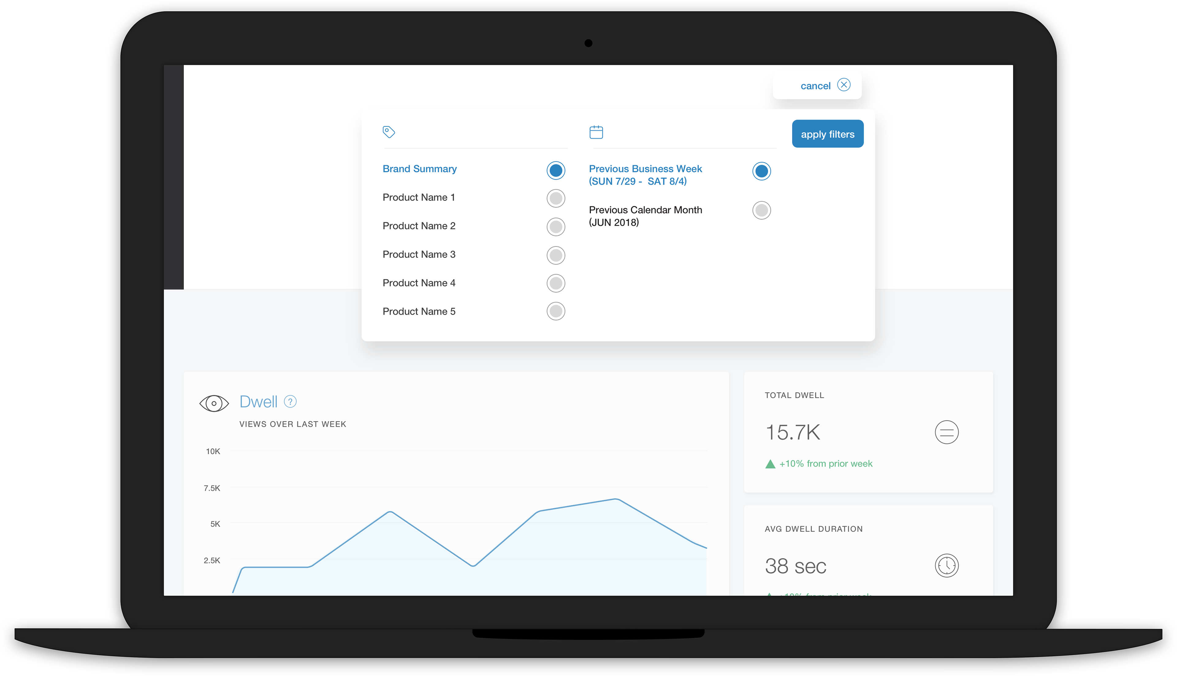
Filtering modal where vendors can choose whether they want information for all of their products are one of them, as well as the date range.
Smooth animation for the filtering modal.
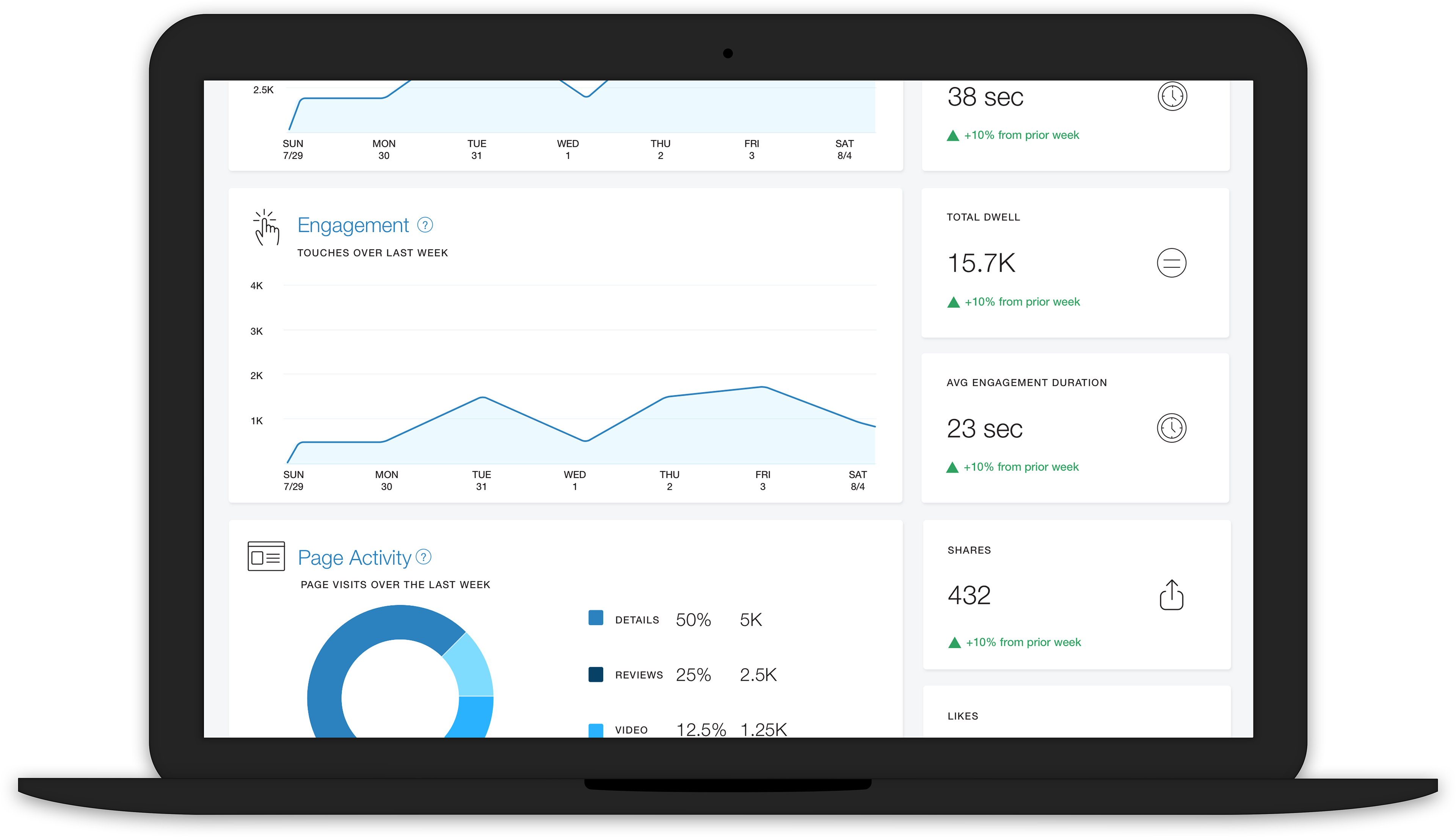
Dwell, Engagement, Page Activity and related averages with benchmarking.
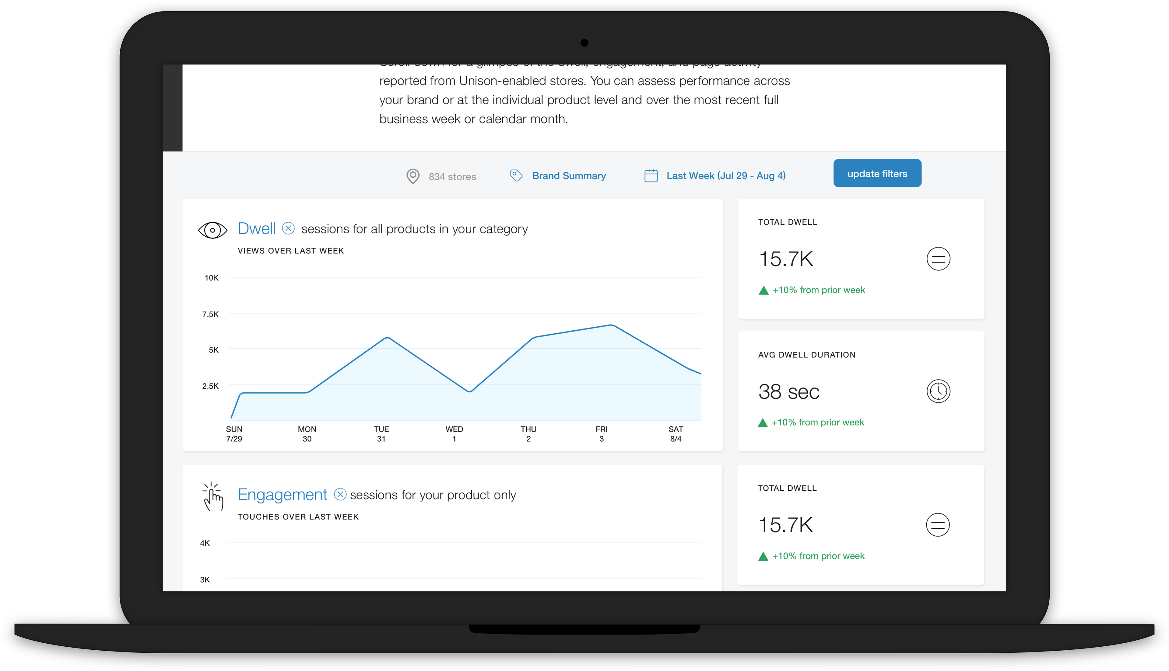
As with the previous dashboard, clicking the "help" icon brings up the metric definition.
Animations for metric definitions on the Dashboard page.
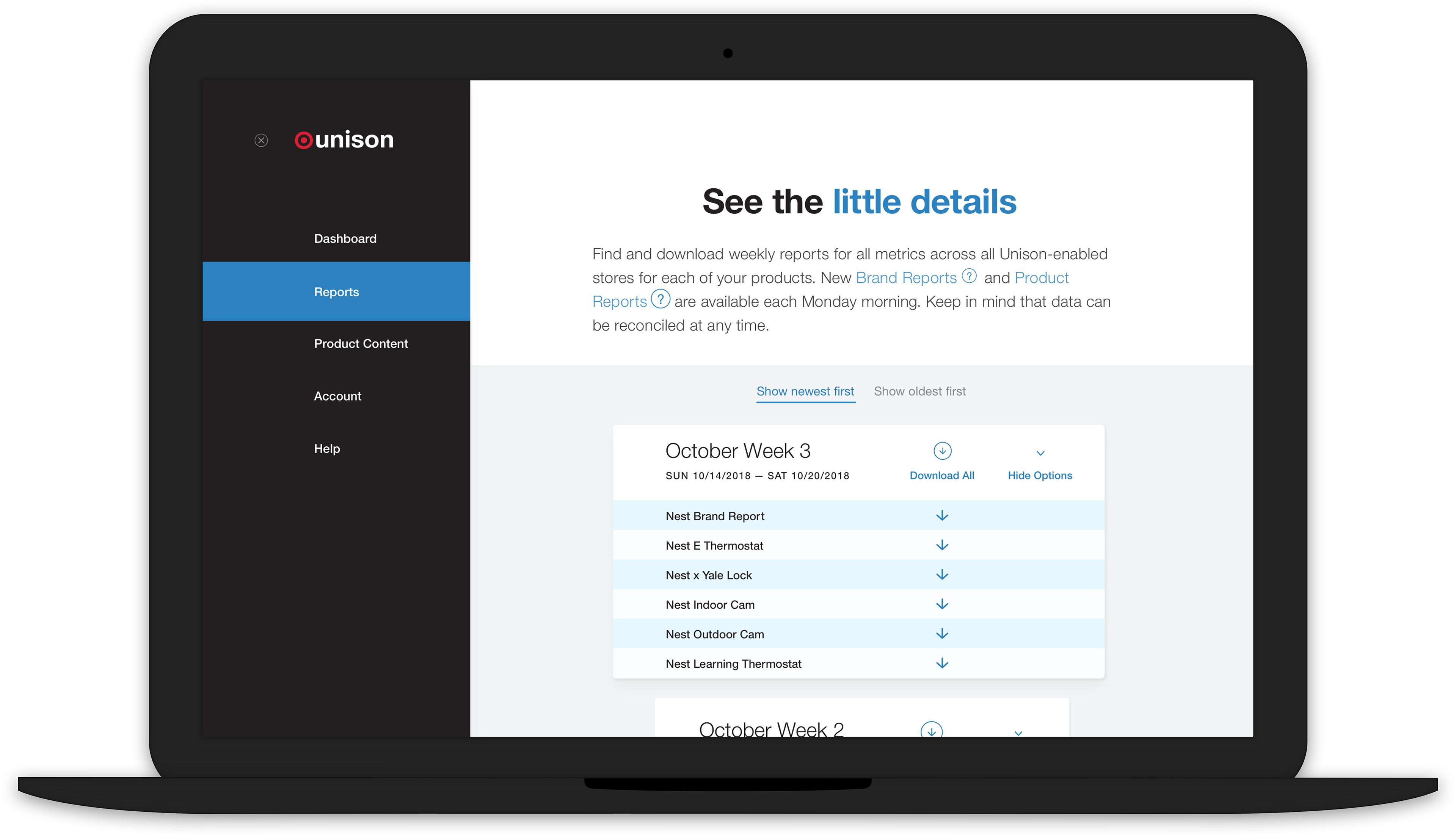
Landing page for the Reports page. Sidebar is open. The most recent week is open by default.
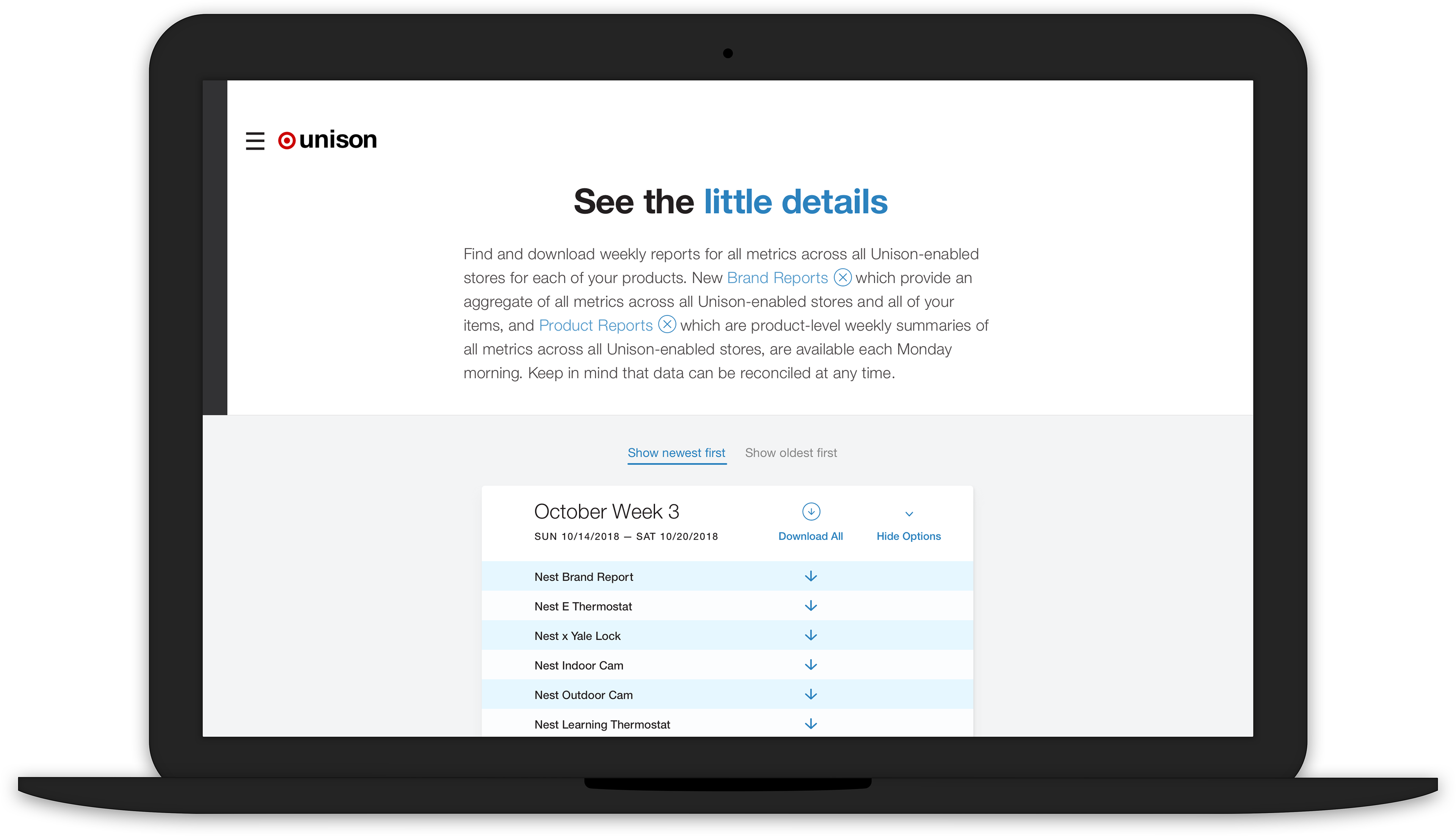
"Help" buttons are included within the text for vendors to reference. Sidebar is closed.
Animations for metric definitions on the Reports page.
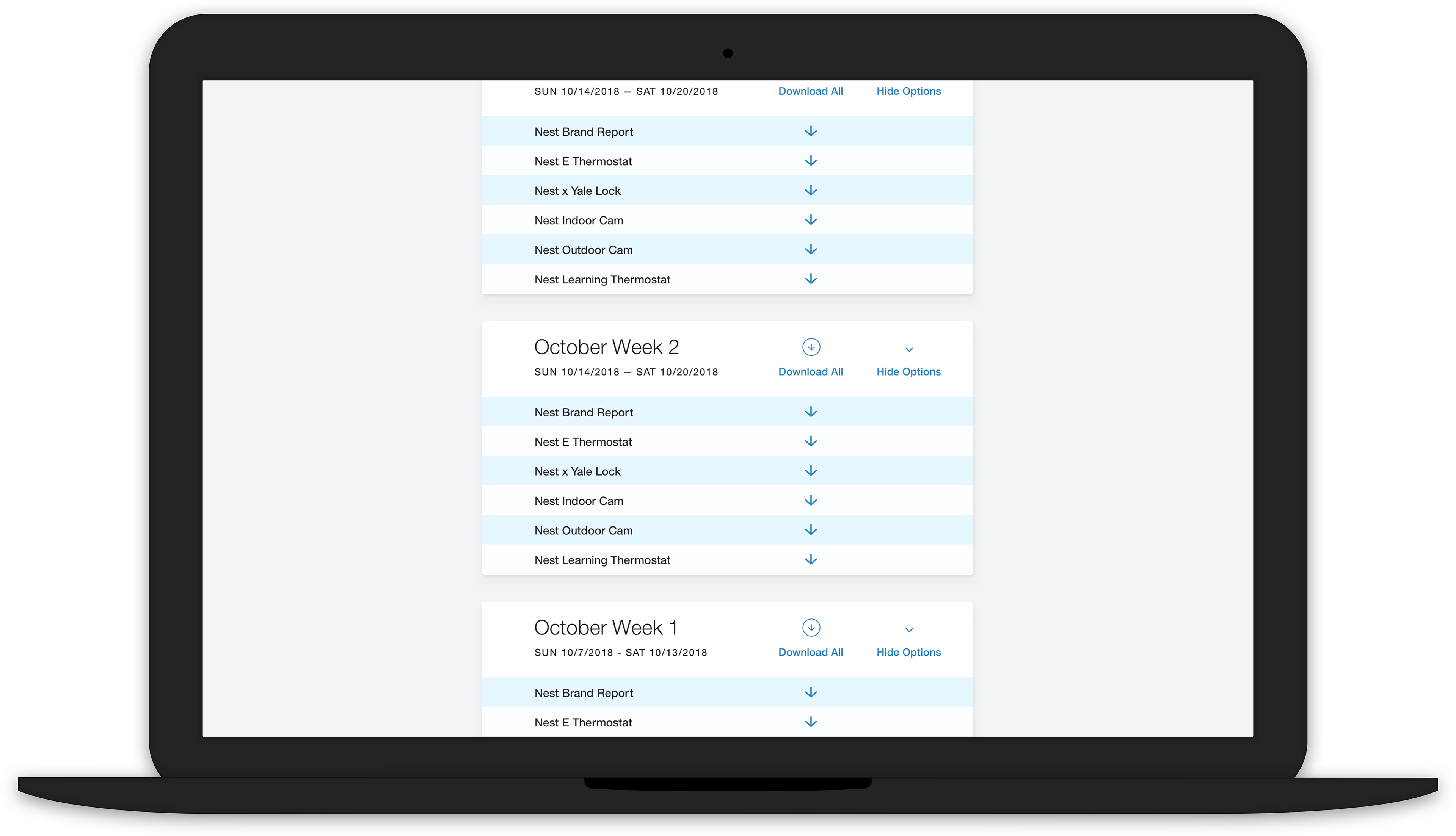
Reports are organized by weeks, as is customary with sales data.
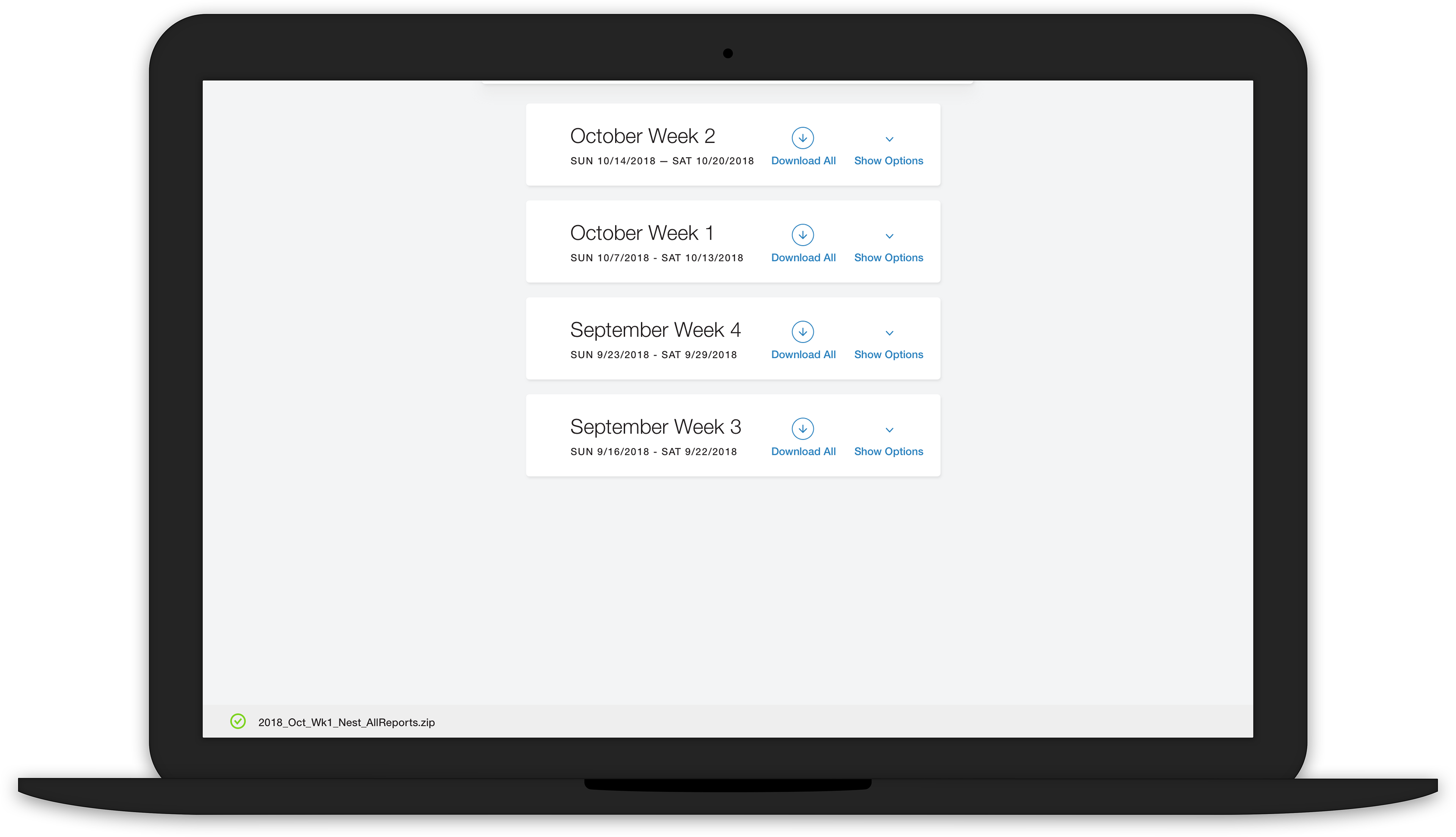
A group of reports is successfully downloaded. The naming convention makes for easy reference and searching.
Expanding and collapsing the reports modals.
Opening and closing the sidebar. Animation in ProtoPie.
Experimenting with sticky navigation.
Animation for the filtering modal in slo-mo.