What was the central goal?
The core problem
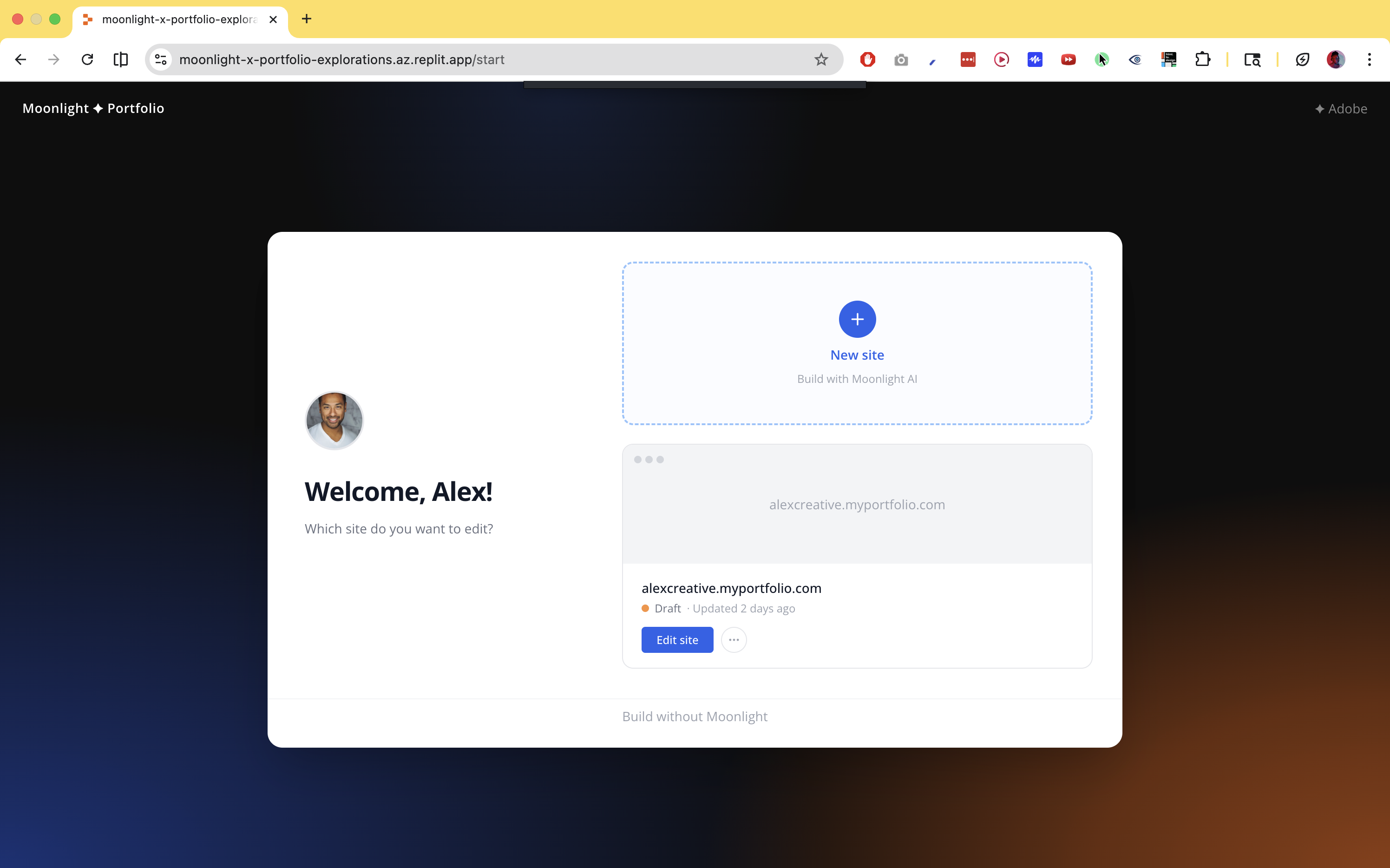
Creatives already have their work. What they don't have is a frictionless path from scattered assets to something that represents them well, to the right person, in the right context.
Three things compound the problem. Assets live in too many places: Lightroom, Behance, native files, Figma, old portfolio sites, each carrying partial information. The blank slate forces premature decisions: pick a template before knowing what you have, write a bio before knowing who's reading it. And tailoring for different audiences currently means maintaining multiple portfolios, or one generic one that serves no one well.
The design challenge was resolving all three without replacing one kind of friction with another.
Source ingestion and the enrichment graph
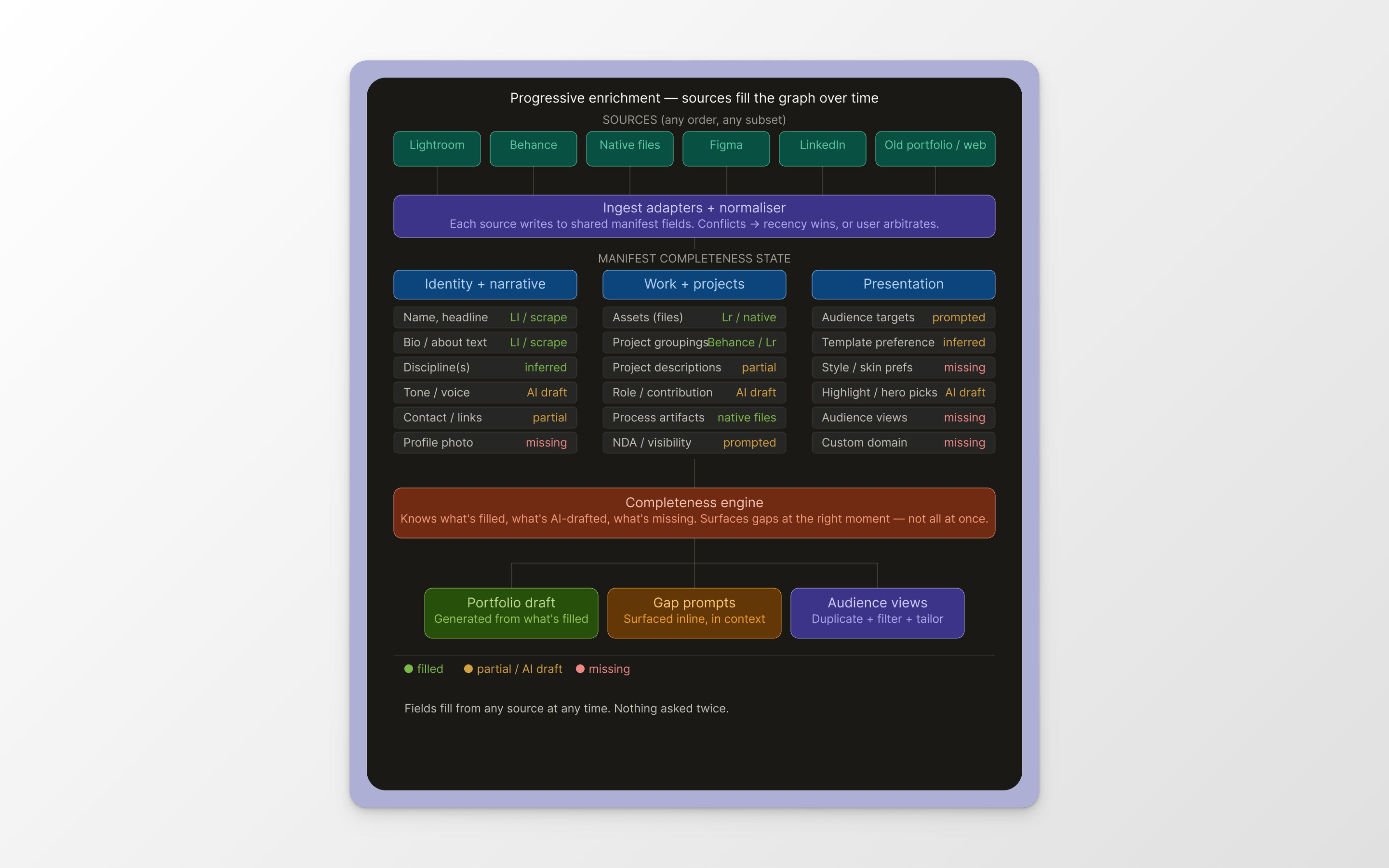
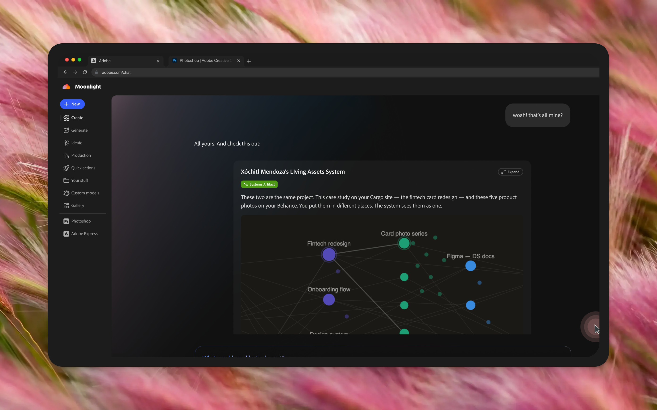
Every source is treated as a partial contributor to a single manifest, rather than requiring users to input information from scratch.
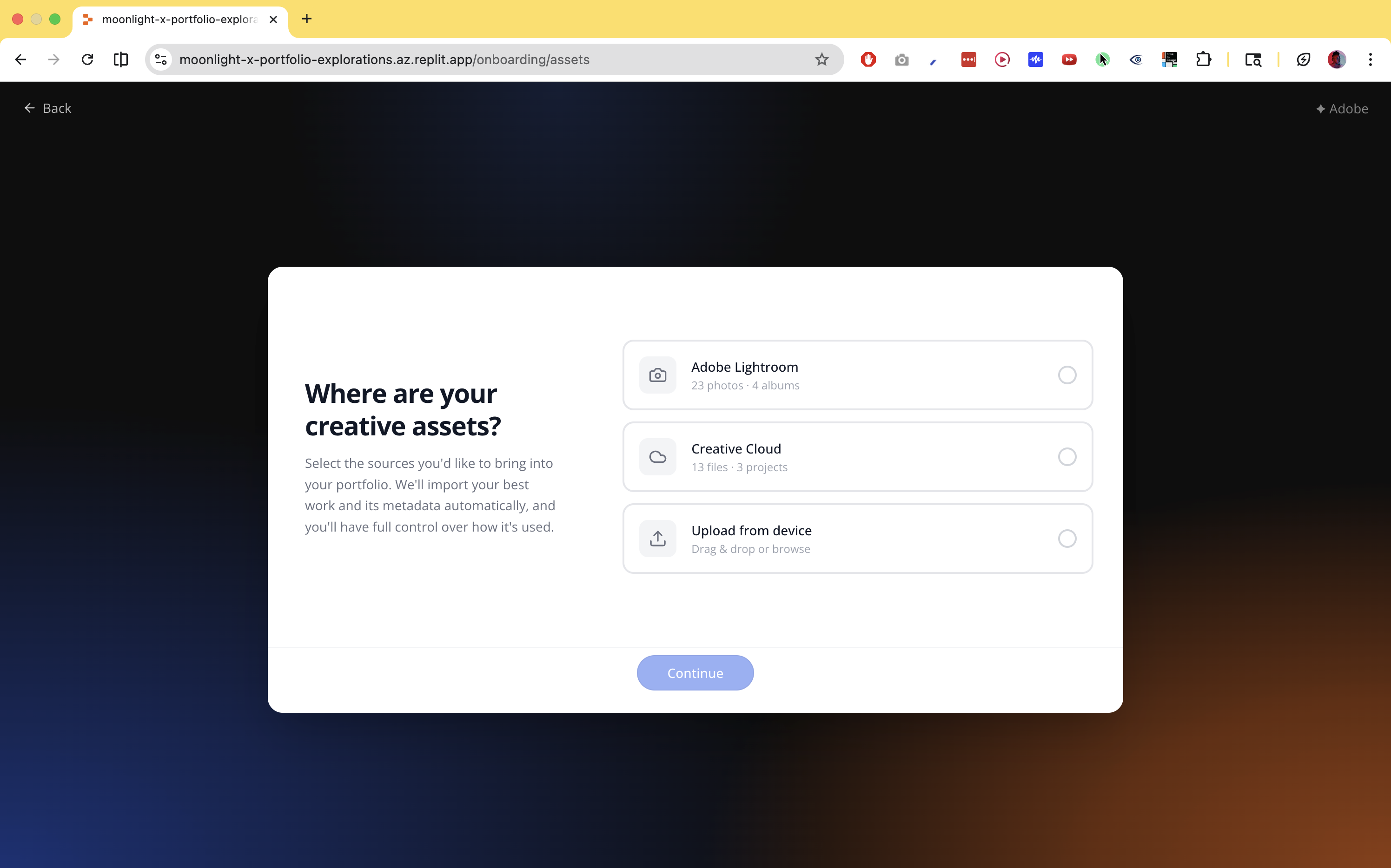
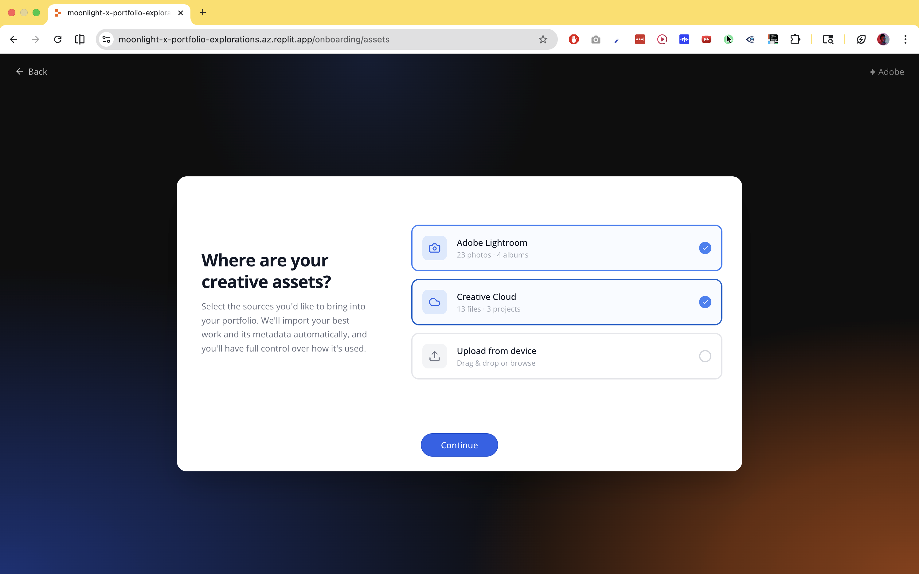
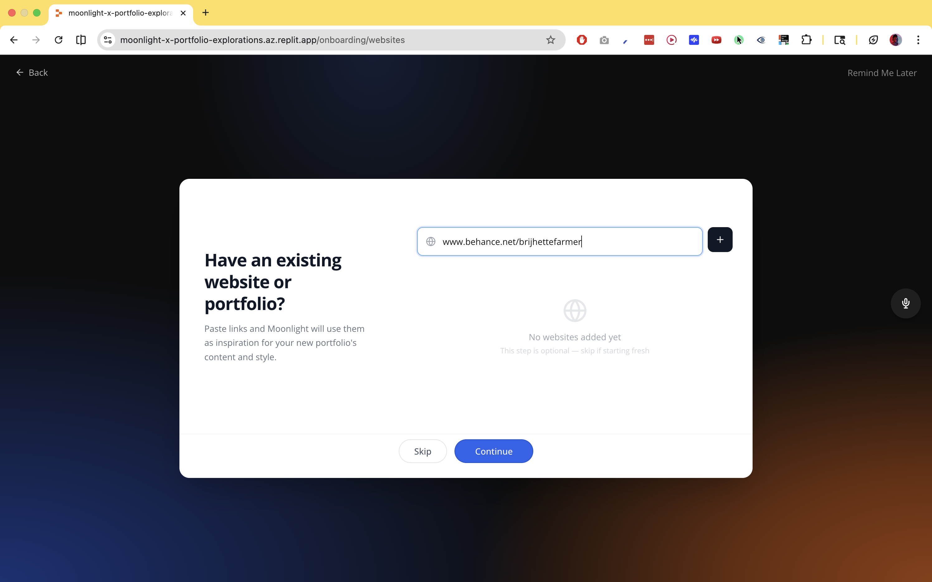
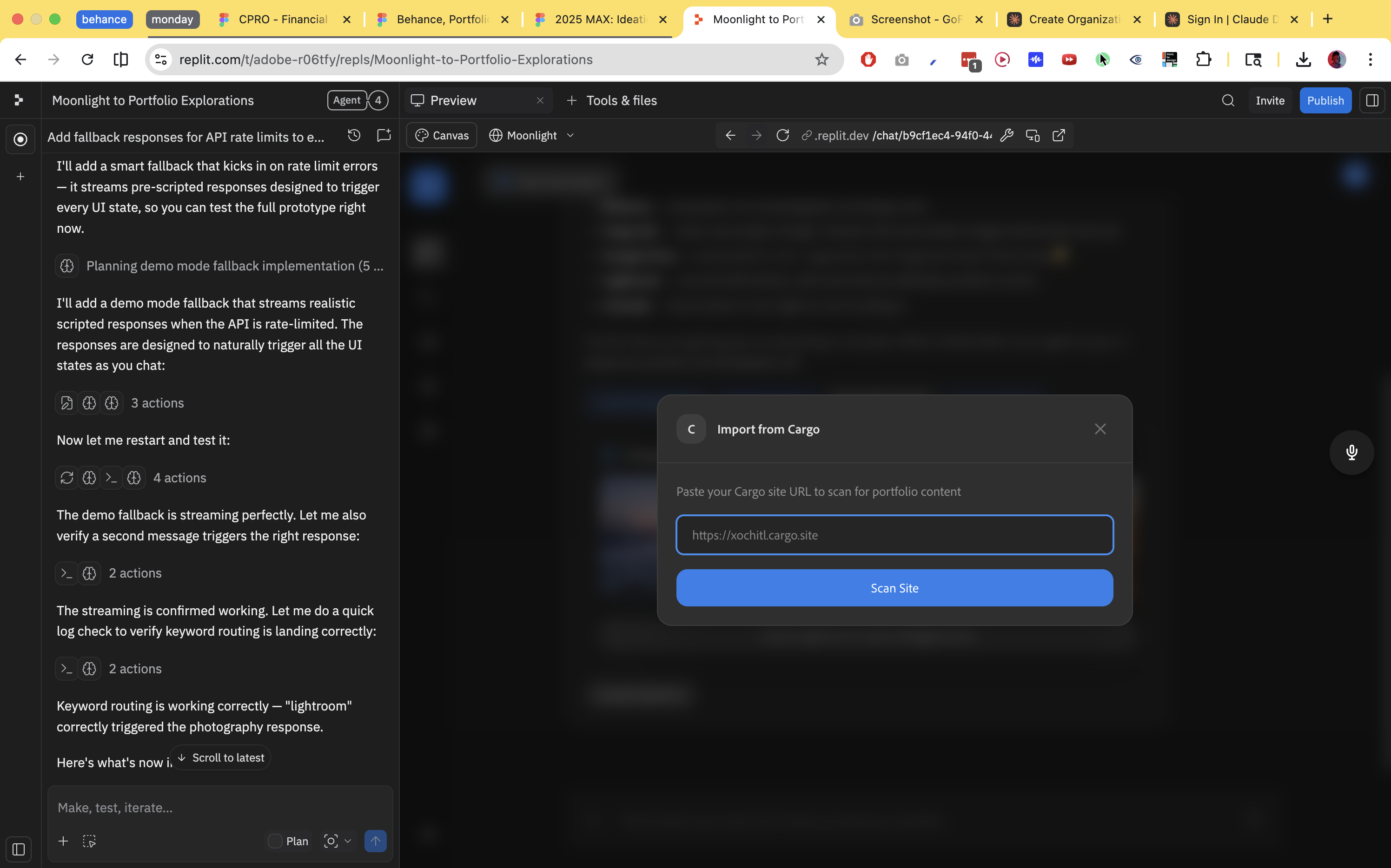
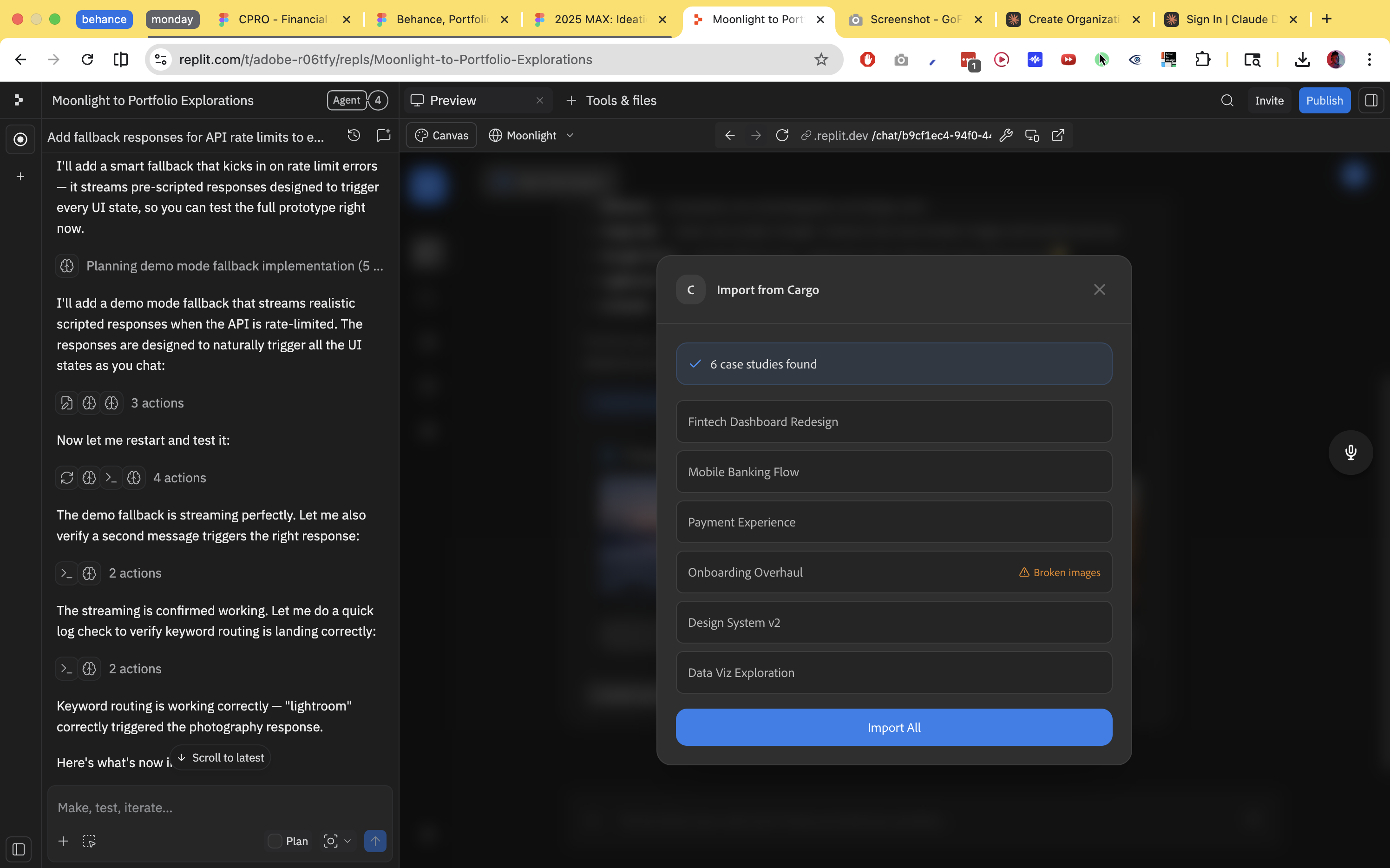
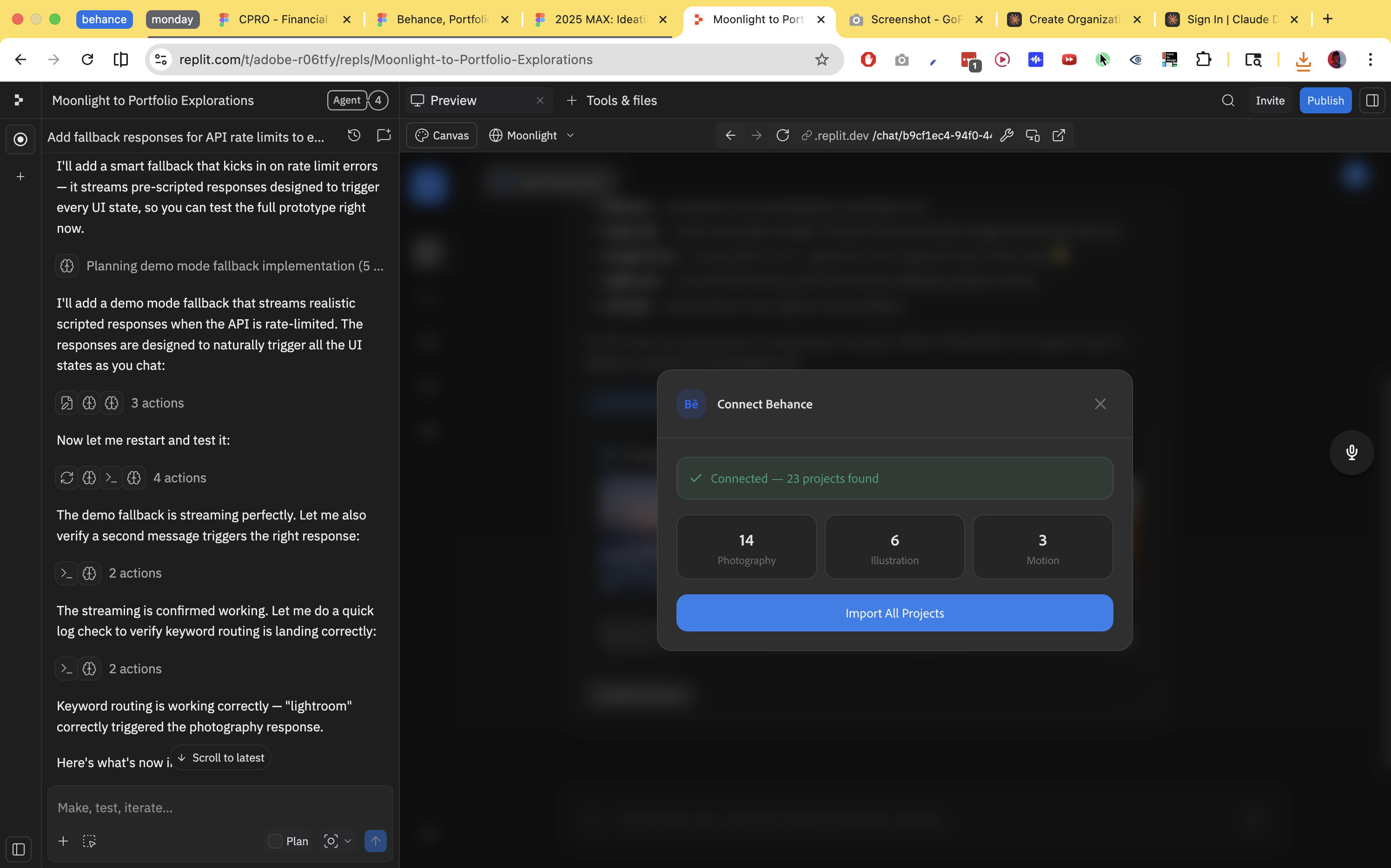
Each source type — Lightroom, Behance, Creative Cloud, native files, links, loose uploads — has a dedicated ingest adapter. Each extracts whatever metadata is available and writes to shared manifest fields. Fields that can't be populated get flagged for AI enrichment or deferred to user input. Nothing is asked twice. Once a field is user-confirmed, it's locked.
Completeness is a first-class data structure, not a null-check. The system always knows what it has, what's AI-drafted, and what's missing, and uses that state to decide what to surface and when.
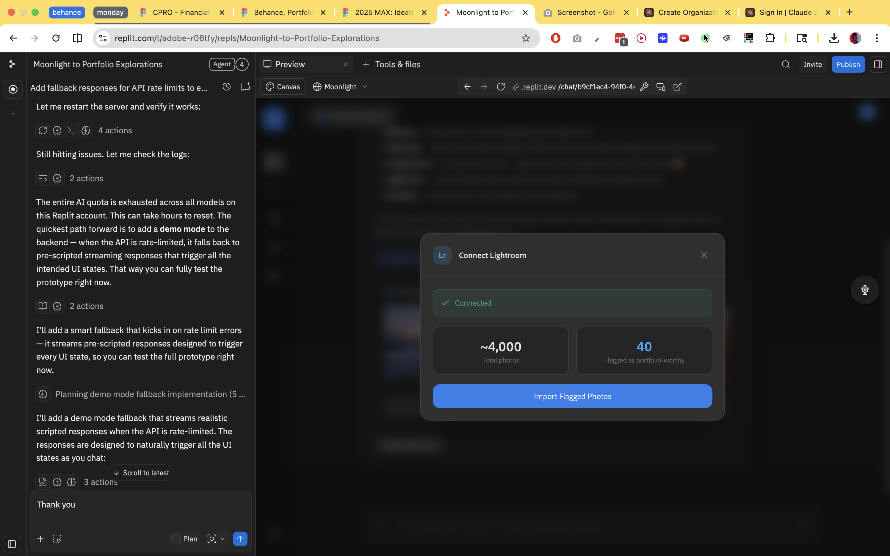
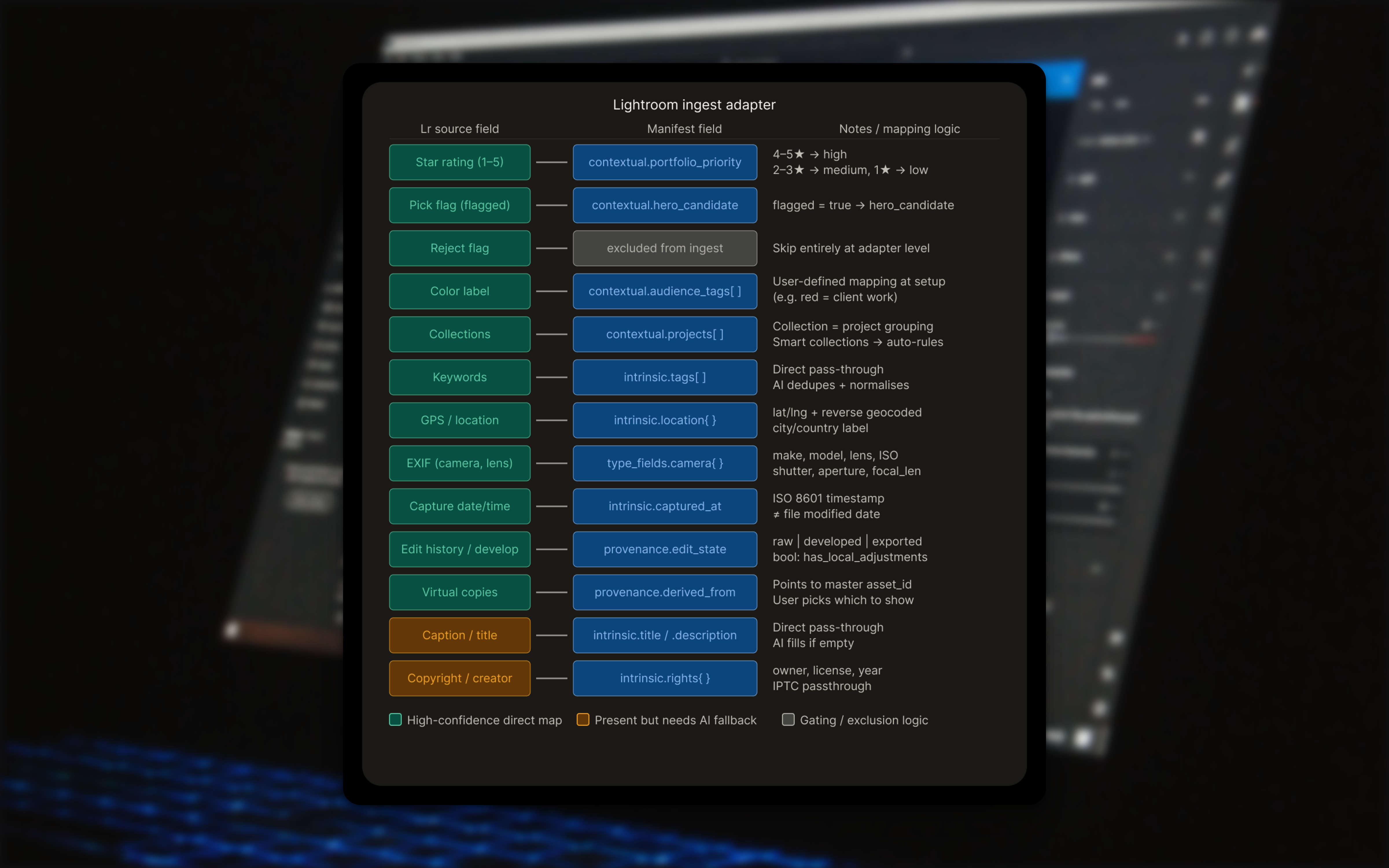
Lightroom was the richest source. Star ratings, pick flags, collections, keywords, GPS, EXIF, and edit history all map cleanly to manifest fields. The more interesting design problem was Lightroom's color label system, which is user-defined and means different things to different photographers. The adapter prompts a one-time mapping at connection, and uses that moment to ask whether any labels mean client or NDA work, pre-seeding visibility logic downstream.
Native file deep parse
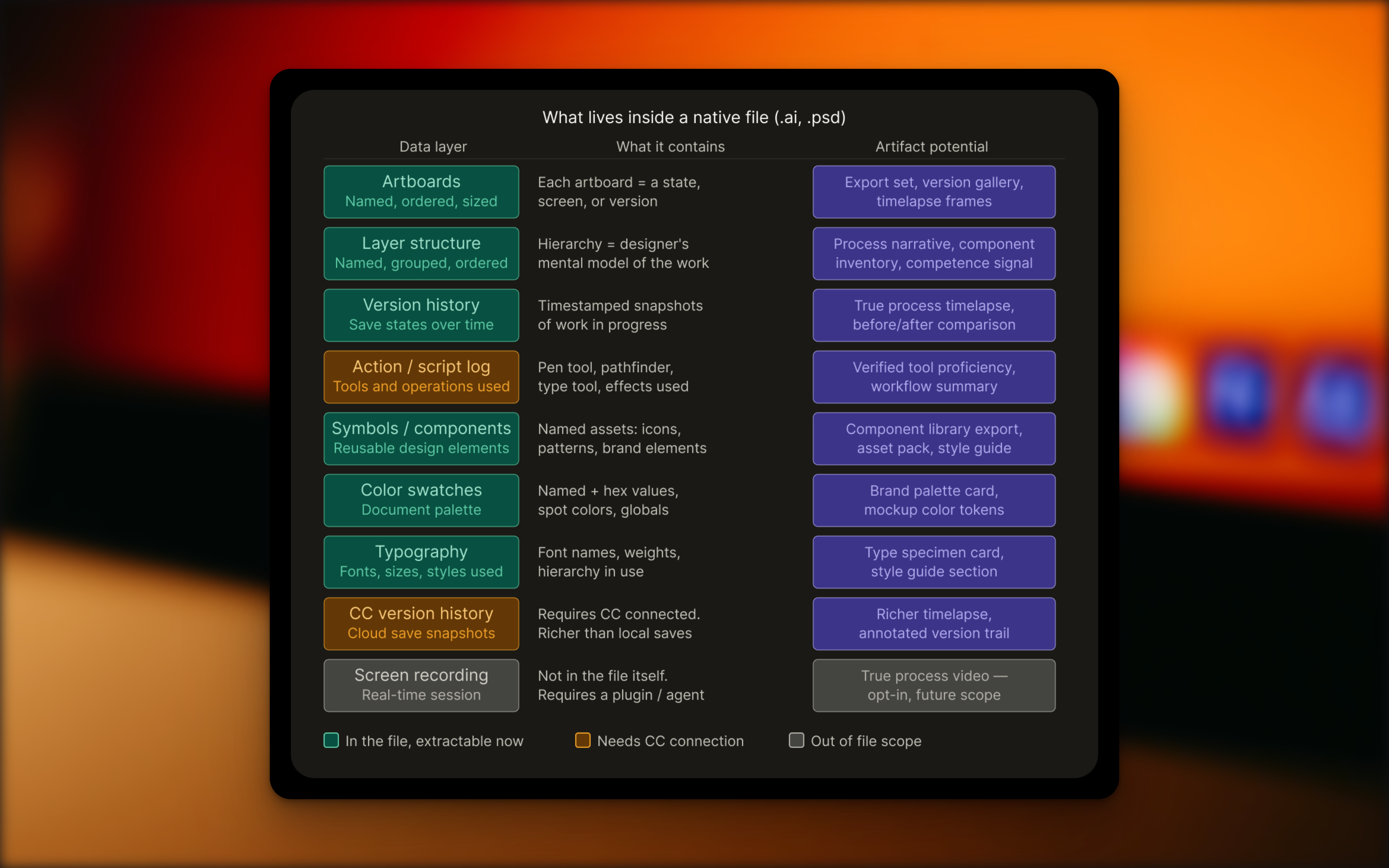
Most systems treat a native file as a source of a thumbnail. An .ai file with 16 artboards is treated here as a complete record of creative work.
The layer structure maps to the designer's mental model. Named artboards represent versions or states. Color swatches, typography, and symbols are all extractable. XMP metadata travels with the file. If Creative Cloud is connected, version history is a literal record of the work evolving over time.
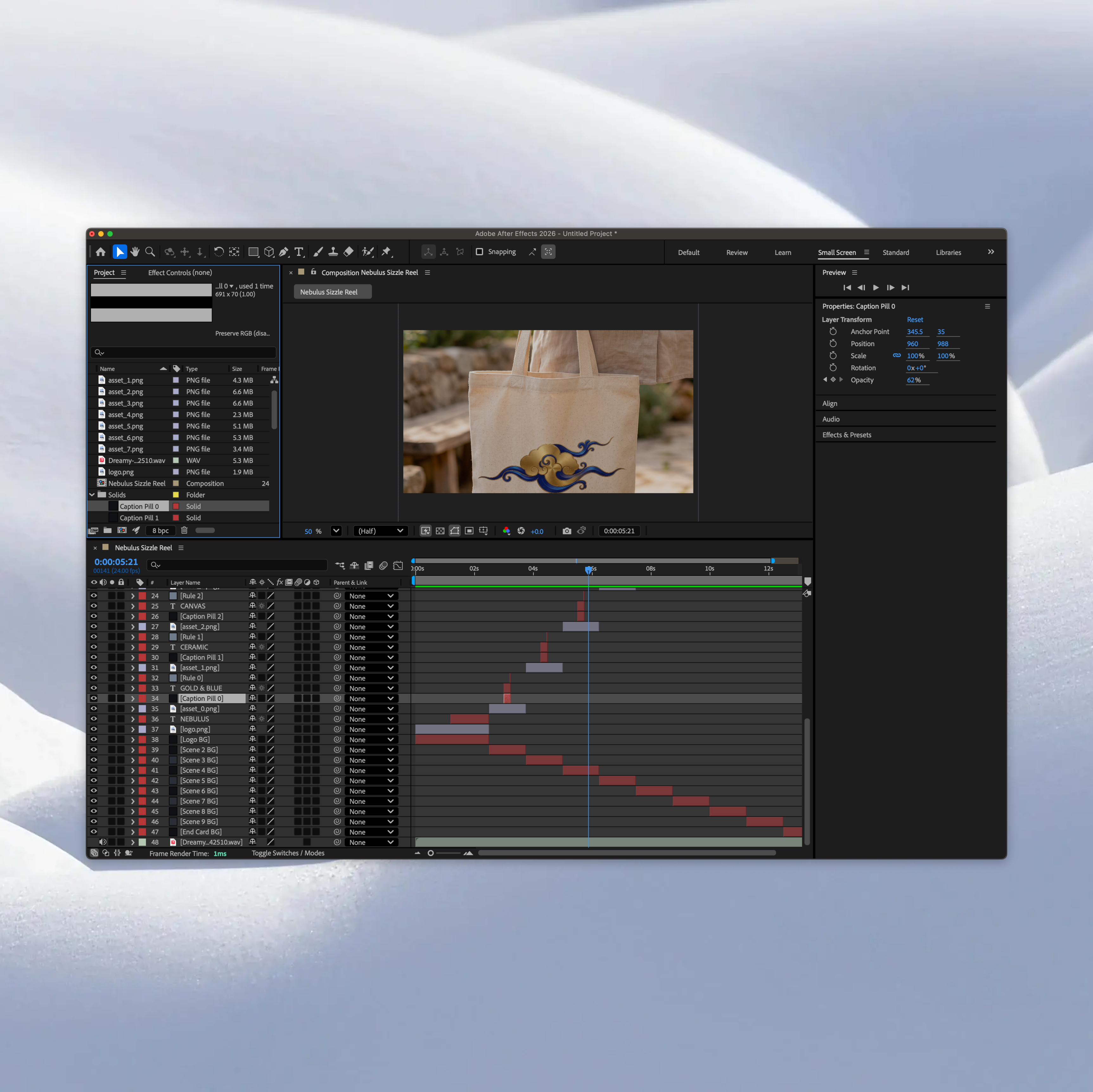
The pipeline renders each artboard and speculatively generates several artifacts: a process timelapse GIF or MP4, a case study draft drawn from artboard names and layer structure, a style guide card from swatches and fonts, and a named asset pack ready for mockup use. None are published automatically. The user reviews and selects. Generate eagerly, publish conservatively.
The driving insight was that the cold start problem isn't really about having nothing. Professionals have rich files. Getting value out of those files currently requires significant manual work that the system can absorb.
Discipline inference
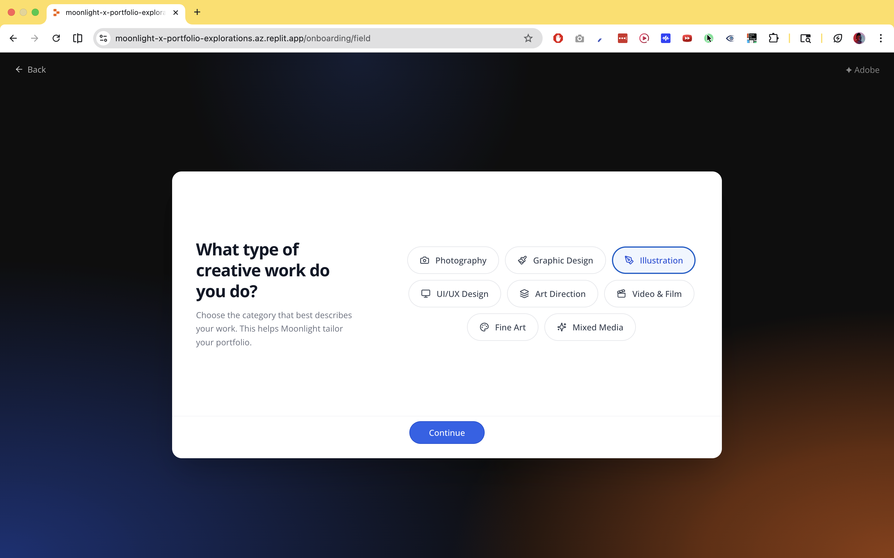
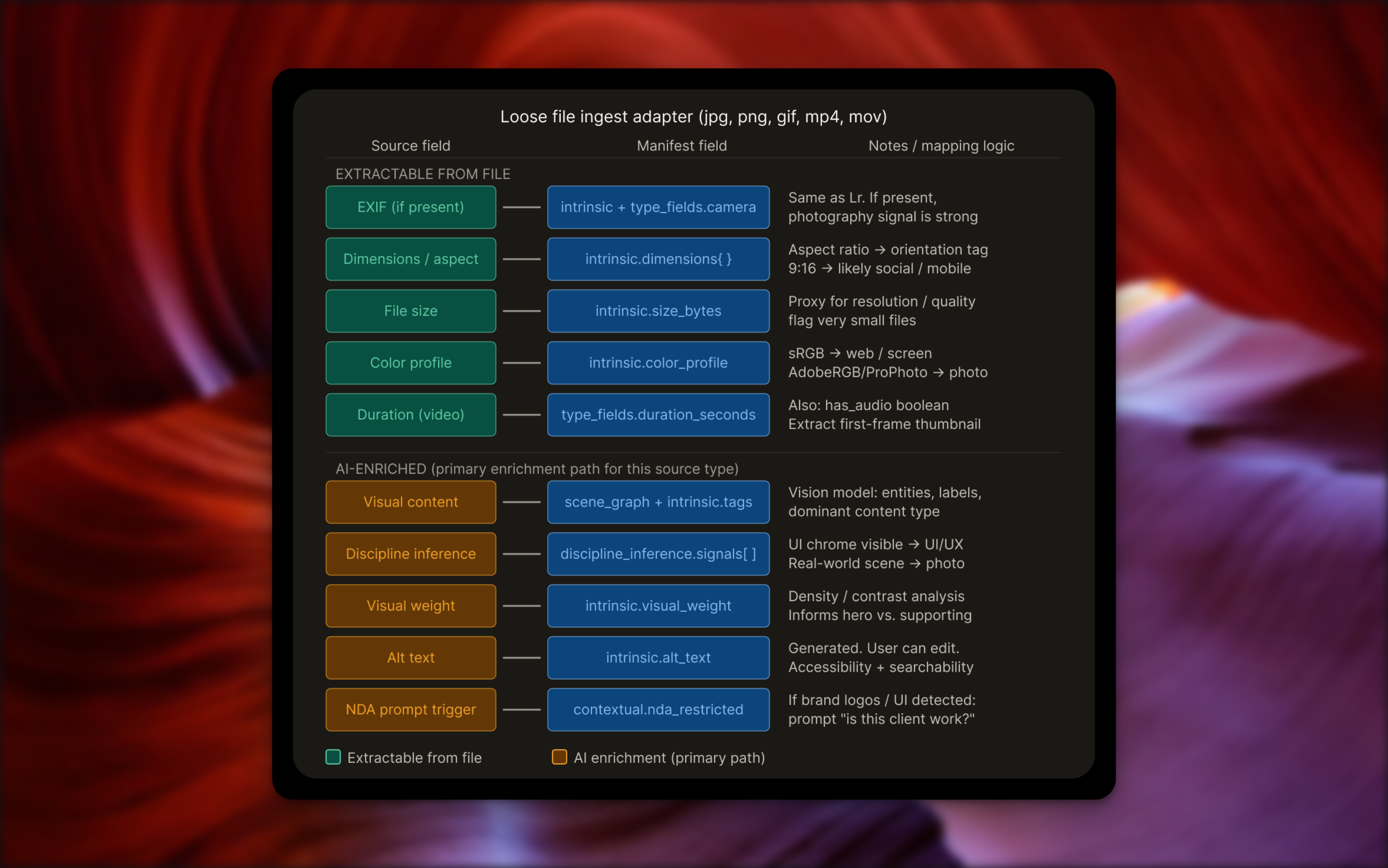
Template selection can't happen until the system knows what kind of creative work it's looking at. Discipline inference runs silently at ingest, combining signals from multiple sources: file format, color mode, layer names, Behance tool tags, Figma frame labels, LinkedIn headline, and visual analysis of rendered thumbnails.
Each signal is weighted and combined into a confidence score. Above 0.75, the system proceeds without asking. Below that, it surfaces a single confirmation: "Looks like you're a photographer — is that right?" One tap to confirm or correct.
The signals array is preserved in the manifest, not just the conclusion. The system can explain its reasoning. Confidence degrades gracefully when signals conflict rather than producing a false-certainty result.
Template scoring
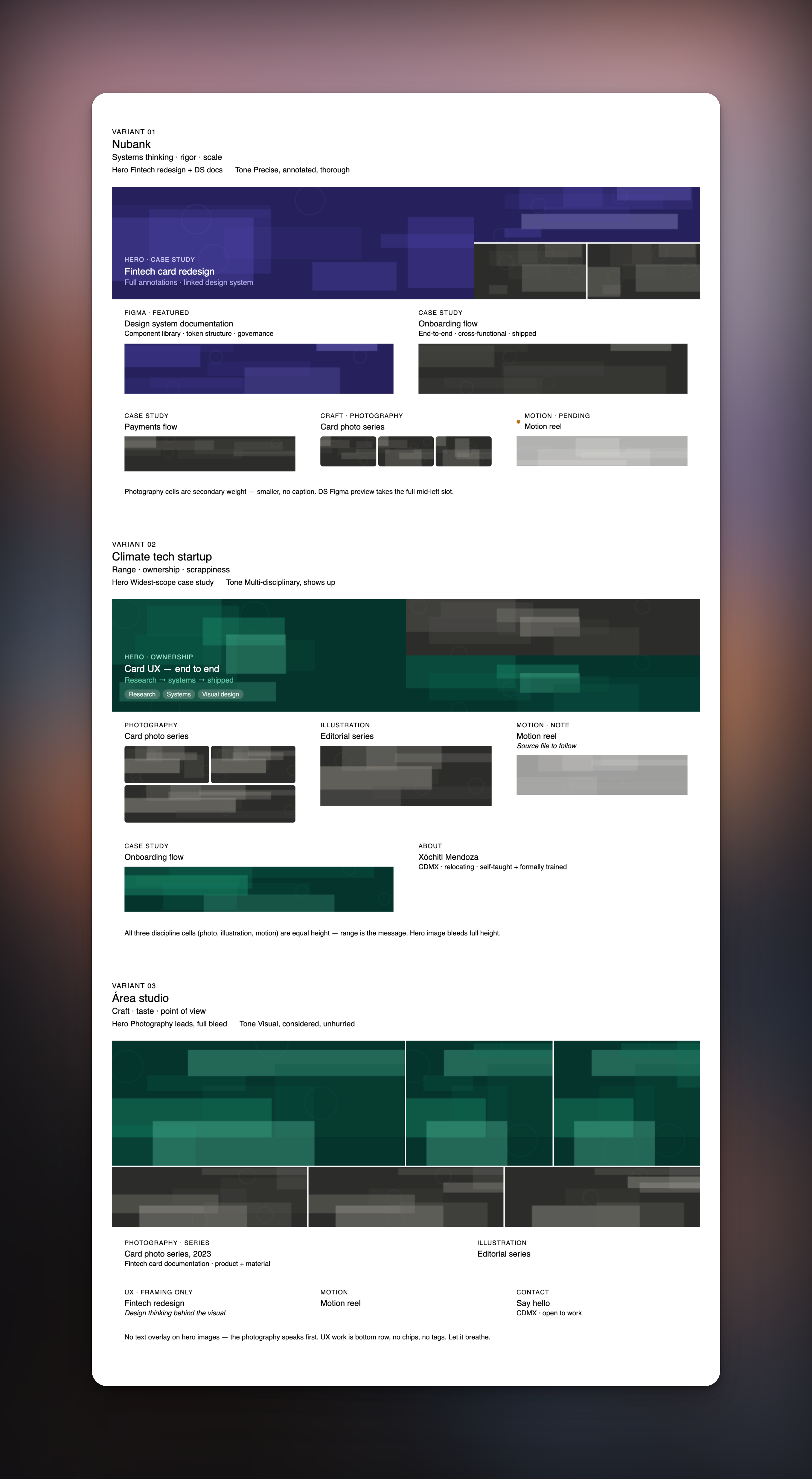
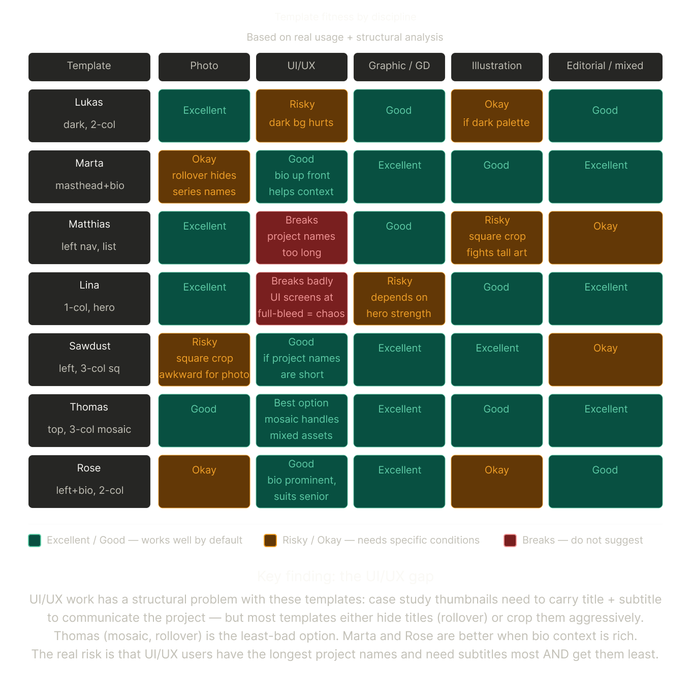
Twelve templates. Six welcome page variants. The goal was to surface two or three that would actually work with a specific user's content, not just their discipline, but their real assets.
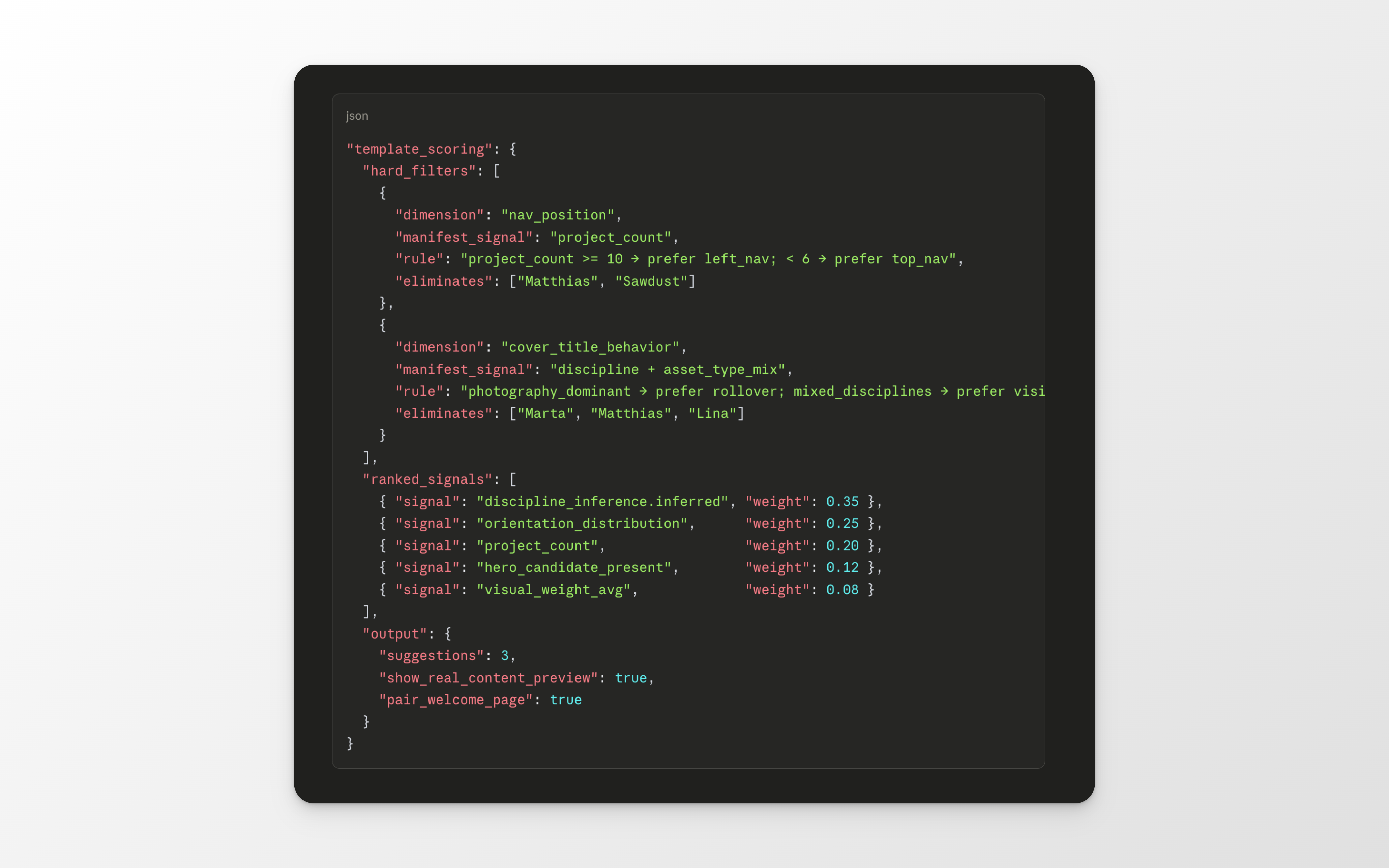
The scoring model distinguishes what's fixed from what's adjustable. Nav position and cover title behavior can't be changed after selection, so they're treated as hard filters that eliminate candidates before ranking begins. Everything else is adjustable and used as tiebreaker.
Suggestions are shown with the user's real content, not placeholder images. A user can't evaluate whether a template works for their architecture photography by looking at a demo. They can only evaluate it by seeing their own hero assets in it.
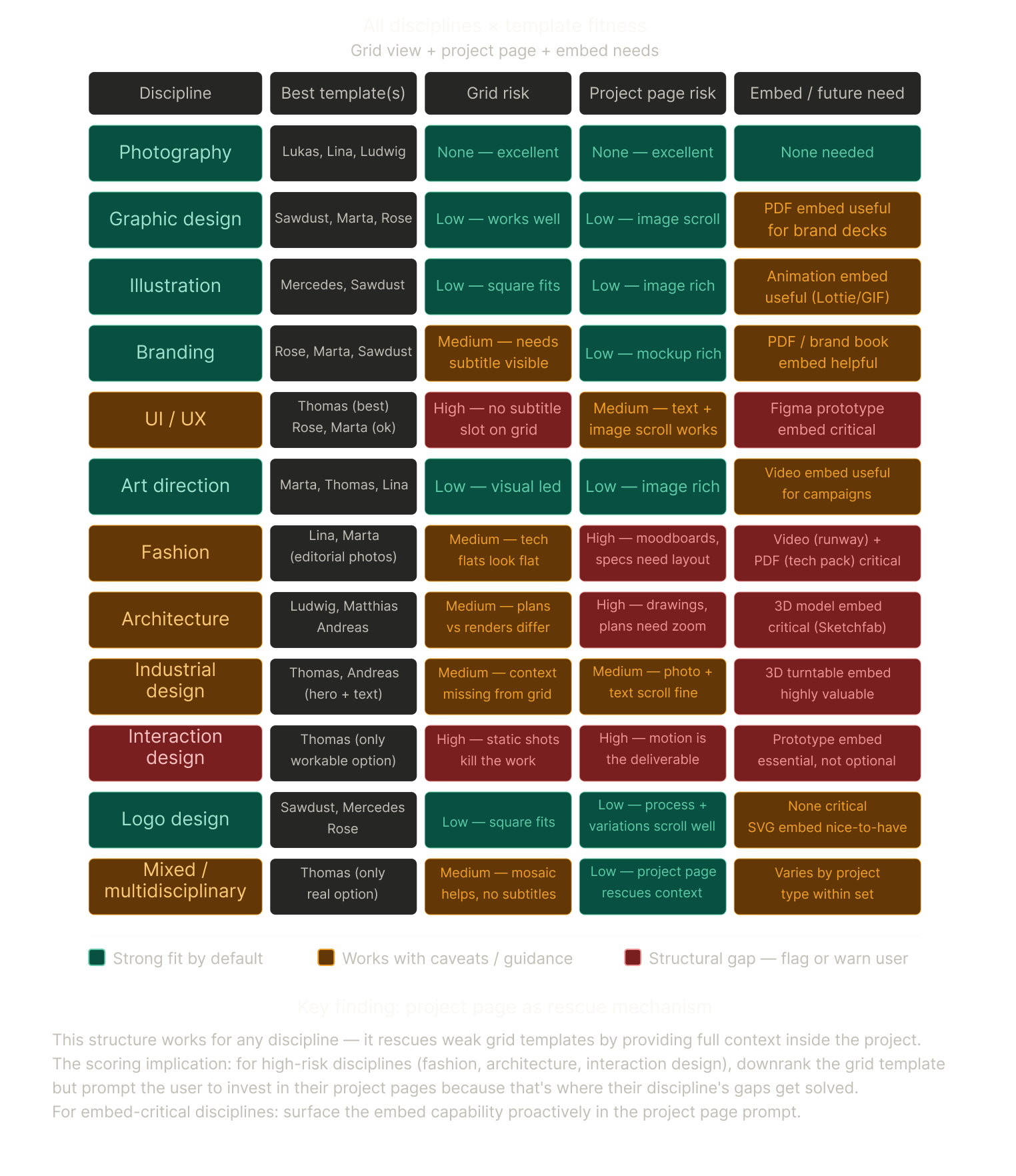
The fitness analysis revealed a real gap for UI/UX and interaction designers. Most templates either hide project titles on rollover, which works for photography where the image speaks for itself, or crop aggressively, which destroys the context that makes UX work legible. No template in the current set has a subtitle slot visible on the grid. That's exactly what UX and product designers need most. Flagged as a v2 template request.
User confirmation flow
The principle: show first, ask second, ask only one thing at a time.
The confirmation queue is a structured data model with six gates, each triggered by a specific condition, each with defined timing. Maximum one prompt visible at any moment. Discipline confirmation blocks template selection — it can't be skipped. Everything else surfaces in context: NDA flags appear when a project is opened for editing, not during setup. Audience view suggestions appear after the first publish, not before.
Dismissed prompts defer for 48 hours. They don't disappear.
Narrative and audience views
A portfolio for a fintech hiring manager and a portfolio for an agency creative director aren't two different portfolios. They're two different entry points into the same body of work.
The narrative model separates what never changes — the work record: problem, process, solution, outcome — from what's audience-sensitive: subtitle, lede sentence, emphasis. The user writes the structured record once. For each audience view, a subtitle and opening sentence are drafted that foreground the right dimension: outcomes for a business audience, craft and process for a design peer, in vocabulary that fits the context. The user confirms or edits those two fields. That's the tailoring effort.
An audience view is a filtered projection over the shared manifest, not a copy. Assets exist once. The view defines which projects are included, in what order, with what intro text. Changing the underlying work updates every view automatically.
The embed gap
For interaction designers, architects, and industrial designers, a static image is not the deliverable.
The embed detection schema operates at the use case level — interactive prototype, 3D viewer, data visualization — rather than coupling to specific platforms. When a Figma link appears in the manifest, or a .blend file arrives in the upload queue, or a Matterport URL is detected, the embed capability surfaces in the project page setup. Not in a features menu. Not in a help article. At the moment the user would otherwise be stuck.


.png)
.png)
.png)
.png)

And the tl;dr
What's next
The beta serves photography, graphic design, and illustration well. The template set fits, the metadata from Lightroom and Behance is rich, and the cold start problem is largely solved for those disciplines.
The open problems are honest ones. UI/UX and interaction design need a template with a subtitle slot. Architecture and industrial design need 3D embed guidance that doesn't depend on platforms in flux. Fashion needs project page investments rather than static grids.
The system is designed to know what it doesn't know. This is the part I'm most proud of.
Note: The deep schema systems are ones that I personally developed while designing improvements to Portfolio. They were not adopted by Adobe or implemented into any product (though it'd be awesome)!